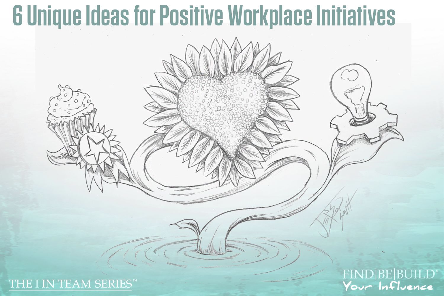
The Psychology of Color
Color psychology in business consulting
Written by: Mary Smith
It has long been known that colors can assist in provoking various feelings and emotions. This is why when we paint the inside of our homes, we choose colors that invite the emotions we want ourselves and our guests to feel in our house. Even without knowing that colors can produce certain feelings, we do this because it is how our brains are wired. Our emotions are sparked by color in nature, and we might be able to distinguish these feelings if we pay close enough attention. Taking a walk in the summer when the trees are green will produce different feelings as to in autumn when they are orange, yellow, and red. Same goes for spring when they are all in bloom with pink and white flowers, and in the winter when they are bare, black, and covered in snow. You may walk the same path each time, but each season will provoke different feelings due to the color changes. This is why certain companies use certain colors in their logos , stores, websites , products, and marketing campaigns. It is to provoke certain emotions from their target audiences to hopefully receive the outcome that they desire.
We recently changed our branding by introducing a contemporary color palette to our company’s logo, web design, and marketing materials, and so I thought it fitting to discuss the psychology behind primary colors, the feelings they invoke, and the companies that use them in their logos. If you’re looking for ways to best position your company to appeal to your target market, then consider how the colors you are using subconsciously influence your customers.
Here are some primary colors, their functions, and companies that use them:
RED
The color red has always been used to assert dominance and to grab attention. It is a powerful color that demands to be seen above what is around it. It is also the color that provokes love and passion. CNN is a great example because it is the only news station that uses only the color red in its logo. This asserts dominance and creates a feeling of power to the viewer. It is associated with movement, excitement, and passion (which would explain the 6:00 pm news broadcast). The Nike “swoosh” is typically red as the color can create physical stimulants in the human body including, but not limited to, faster heart rate, a rise in blood pressure, and an activated nervous system. Red, as well as orange and yellow, is also associated with stimulating a person’s appetite. Look at almost every single fast-food chain’s logo. It will almost always have one of these three colors in it or a combination of the three.

Purple
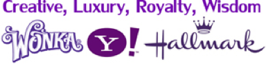
Often associated with royalty and wealth, the color purple is perfect for those who want to instill a feeling of luxury. Darker and deeper shades of purple will have this affect, while some of the lighter shades of purple have a softer, more feminine affect. All shades of purple will promote a feeling of wisdom, due to the historically use of the color for royals, as well as creativity and spirituality. Purple is thought to be used by those who are positive, mindful, kind, meditative, enchanting, inviting, and intuitive. A food and drink that use the color purple, Crown Royal and Cadbury , seem to be doing so to show that they are luxury brands as compared to their competitors, but they are also enchanting and inviting.
Green
When the color green is typically brought up, it is most often associated with the earth and life. It is used to promote environmental issues and to show that companies are promoting sustainability. The color promotes a feeling of health, maturity, and growth. While the color can be confused for only offering these qualities, it is also very much associated with wealth and money. With wealth and money comes power. Brands that are trying to promote their sustainability are brands such as Eco , Animal Planet , Whole Foods , and the recycle symbol. Many companies that are showing their wealth and therefore power are companies such as Holiday Inn , Land Rover , Monster , Heineken , and Xbox.

Gold
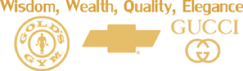
We most often associate gold with jewelry, thus the color provokes feelings of wealth, divineness, luxury, valuableness, and prestige. This color glows and radiates feelings of quality and elegance.
Grey
Grey is an often-forgotten color as well due to its plainness, but the color invites feelings of timelessness and logic. It is cool and unobtrusive while still showing its mature, classic quality. It is modest, dutiful, mindful, responsible, professional, and conservative. This color, when used correctly, could show a company’s ready to take on the business world while showing its consumers that they are professional and logical. Using this color can be tricky in larger situations. Some have reported that too much of this color will provoke feelings of death, old age, and depression. Use this color in smaller logos and minimally while designing products.

Yellow
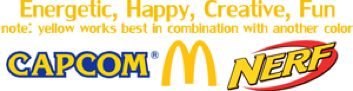
This is a color that I often associate with babies and young things. It is a color of cheer, sun, warmth, and energy. It is sweet and pleasing to the eye, however bolder yellows, when used more abrasively, can provoke feelings of anxiety. As mentioned earlier, it is also a color that promotes hunger.
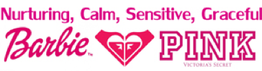
Pink
Pink is almost always associated with women and young girls. It is a color that promotes feelings of sensitivity, calmness, and nurturing. While these are all emotions that are typically associated with women, the color pink used to be a “man’s color.” Baby boys were more often dressed in pink than blue because it was seen as the more dominate color. Being closer to red, the color pink grabs attention much quicker than some cooler opponents. While now it is mainly used for brands that are geared towards women, it is still a color to consider as powerful and assertive, while maintaining its sensitive and calm vibe.
Blue
Blue is commonly used by offices and conservative corporate companies because it provokes feelings of dependability and loyalty. It provides the consumer with a feeling of trust and security. It is a color most children describe as being associated with maturity. Companies like Walmart , Visa , AOL , and GE all use blue to invite these feelings in their consumers. Different shades of blue will promote feelings like tranquility, peace, and calmness. This coupled with the feelings of security and dependability is why a lot of brands choose the color blue.


Brown
Along with green, the color brown is often associated with the earth. The color promotes feelings of being grounded, rooted, whole, durable, secure, reliable, traditional, and supportive. Not many companies use the color brown for their logos, but with as many feelings as this color provokes, it should be looked into a little more. It is very familial and friendly.

White
White is often used in tandem with another color due to its lack of color. However, this lack of color produces many feelings that may be sought out in consumers. Feelings include purity, cleanliness, innocence, silence, light, clarity, efficiency, and simplicity.

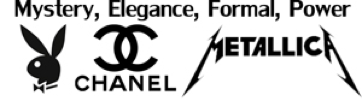
Black
This color is very powerful and classy. It is elegant and sophisticated, while remaining mysterious, bold, and magical. It is another color that asserts dominance in the realm of expensive and prestigious. Using this color is highly recommended for companies wishing to make a statement while remaining bold and elegant.
Orange
This is a positive color that promotes many different feelings according to the shade. It has a fun, warm, energetic, active, spontaneous, and social vibe. It is warm and open, and promotes feelings of courage and confidence. Harley-Davidson Motor Company uses orange to promote their brand in order to make the buyer feel confident in their product and give them the courage to go ride.

Choosing the colors to use for your company can seem like a very daunting and difficult task. There are many shades and mixtures to consider, and different color combinations will make your customers feel certain emotions toward your company. Do your research in order to know what colors and color combinations will be right for you. If you would like any advice on what colors you should incorporate into your branding, or if you need a custom logo designed for your company, then contact us today!
© Individual Advantages, LLC 2017
The post The Psychology of Color appeared first on IA Business Advisors.